How we organize information across Healthi App screens to improve and standardize user experience
Healthi App has a relatively shallow navigation depth, and our main 4 features - Tracker, Progress, Recipes, and Community - are accessible directly from our main Tab Bar, fixed at the bottom. This makes it a lot easier for users to understand what the app is about and what features one should expect to find there.
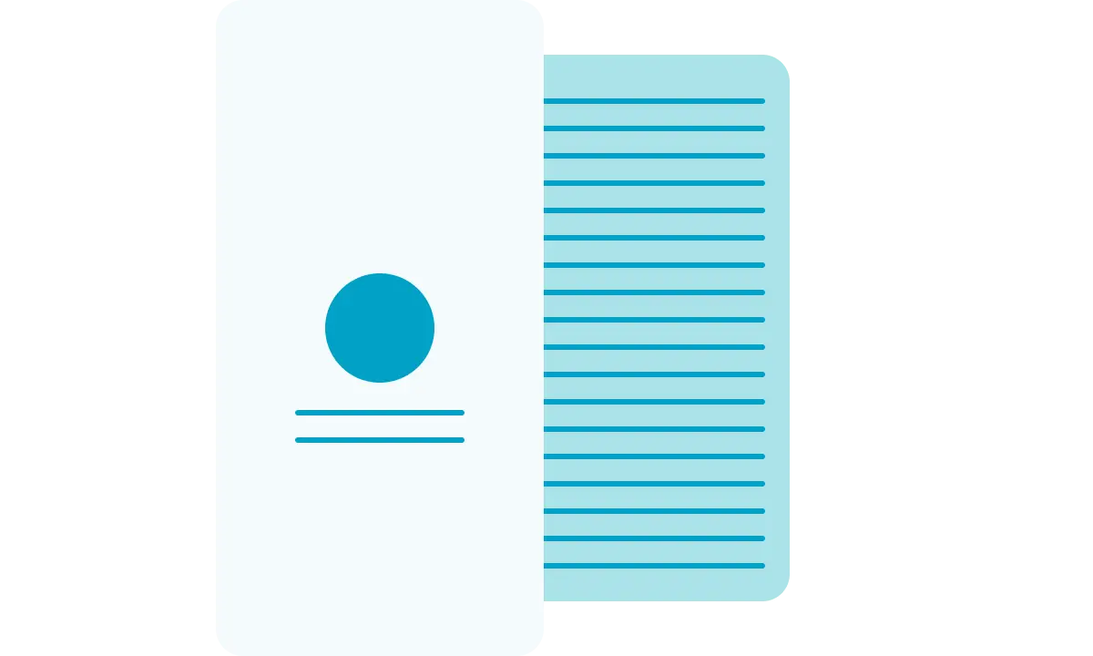
Ideally, screens and features should always consider new /light users and seniors/very active users, as both groups interact with the app in entirely different ways. While a seasoned user might be looking for the Macro details of every food item they consume, a new user might get easily overwhelmed by this amount and complexity of information. To balance that out, we should always consider what is the primary purpose of a given feature and make it the main element (if not the only one) of that feature's starting screen. All other information should be placed one step lower - behind a scroll or a tap. This way, we preserve a basic navigation free of friction, which is ideal for users who are still getting to know us - and easily allow them to go deeper whenever they feel comfortable to.


